class: center, middle, inverse, title-slide # Data analysis II ## Visualisation ### Laurent Bergé ### University of Bordeaux, BxSE ### 09/12/2021 --- # Who am I? ## Laurent Bergé - Assistant Prof., BxSE, Univ. of Bordeaux - [<i class="fab fa-twitter" role="presentation" aria-label="twitter icon"></i> @lrberge](https://twitter.com/lrberge)<br/> - [<i class="fa fa-paper-plane" role="presentation" aria-label="paper-plane icon"></i> laurent.berge@u-bordeaux.fr](mailto:laurent.berge@u-bordeaux.fr)<br> ??? Data visualization is the art of summarizing information from a data source into a pleasant, non-distorted, informative visual representation. Pleasant and informative: those are the keys to deliver a high-impact message. Miss one of them and nobody will listen. The objective of this course is to give the keys to understand what a good visualization is, and provide some tools to make such visualizations. The course will cover some theory: we will talk about things such as color, placement, font and how the brain perceives shapes. We will also work our way through the powerful R graphics engine and the ggplot2 library. Throughout this course there will be many small assignments. --- # What do I do? ## My fields - Applied economics ( `\(=\)` Data + methods) - Economics of Innovation ( `\(=\)` Large data) - (a bit of) Statistics ( `\(=\)` Computational methods) --- # R and me .pull-left[ ### The story - I've met R during my master in 2010 - since then... it's a love story ] -- .pull-right[ ### The outcome of our relationship - 7 packages, 6 of which are public - the packages cover: + econometrics + data handling + statistical models + package development + graphics ] --- # This course ## Data analysis II 1. Data visualization 2. Webscraping --- # Data visualization ## This crash course is not... - really a tutorial on how to make graphs in R -- ## it's rather about... - .it1[opening your eyes] on what makes a good *statistical* graph - learning the tradoffs in graph making --- # Some resources on graph making in R ## ggplot2 - [Andrew Heiss' data viz class](https://datavizs21.classes.andrewheiss.com/) - [Emi Tanaka's data viz workshop](https://emitanaka.org/datavis-workshop-ssavic/) - [Garrick Aden-Buie's guide](https://pkg.garrickadenbuie.com/gentle-ggplot2/#1) ## Base R - [Notes de cours de l'université de Laval](https://stt4230.rbind.io/communication_resultats/graphiques_r/) (French) --- class: section # Q: Why do we need data </br> .invisible[Q:] visualisation? --- class: section # A: Because numbers suck --- # Numbers suck Sort these countries by GDP per capita: |Country | GDP per capita (US$, ppp)| |:--------------|-------------------------:| |Belgium | 50442.05| |France | 45149.10| |Germany | 53752.03| |Spain | 39907.56| |United Kingdom | 45504.84| --- # Numbers suck Sort these countries by GDP per capita: <!-- --> --- # Numbers suck II .panelset[ .pane[{Numbers} What can you say about these numbers? |x |y |mean_X |sd_X |mean_Y |sd_Y |cor_XY | |:----|:----|:------|:----|:------|:----|:-------| |55.4 |97.2 |54.3 |16.8 |47.8 |26.9 |-0.0645 | |51.5 |96 | | | | | | |46.2 |94.5 | | | | | | |42.8 |91.4 | | | | | | |40.8 |88.3 | | | | | | |38.7 |84.9 | | | | | | |35.6 |79.9 | | | | | | |33.1 |77.6 | | | | | | |... |... | | | | | | ] .pane[{Graph} <!-- --> ] .pane[{Anscombe} Same measures; but different data `\(\Rightarrow\)` different stories. <!-- --> ] ] --- # Numbers suck III .panelset[ .pane[{Numbers} Do you see a pattern?  ] .pane[{Graph} Do you see a pattern?  ] ] --- class: section # Why should you take visualization </br> seriously? --- # Because love is an axis story .source[[xkcd](https://xkcd.com/).]  --- # No, it's still because numbers suck - remember that we're very limited human beings! - we only can grasp and understand the world with our 5 senses - abstract concepts (e.g. numbers) are tied to these physical senses -- - to compare numbers we need to visualize them in our head - when we graphically represent numbers, .color1[we cut the middle man] ??? Experiment: I give numbers 1, 10, 100, 1000 and tell them to close their eyes --- # Visualization: why? - powerful way to .it1[understand] the data - powerful way to .it1[send a message] (not the same as the previous point!) - most graphs suck (Excel do you hear me?): it's an easy way to stand out ??? event study graphs next year: many examples of how to make your message impactful based on a set of data the problem is that the students don't see the value of it if they haven't tried hard to make a nice graph so I should give them an assignement in class that they try hard to complete. Only then I can come with theory and advices. --- # Why R? - .bold1[Powerful:] imagination is the limit, you can graph anything you have in your mind (.strong1[really]) -- - .bold1[Versatile:] there are so many packages... - Cartography? <i class="fa fa-check" role="presentation" aria-label="check icon"></i> [cartography](https://cran.r-project.org/web/packages/cartography/index.html), [leaflet](https://rstudio.github.io/leaflet/), etc - 3D + kickass light effects? <i class="fa fa-check" role="presentation" aria-label="check icon"></i> [rayshader](https://www.rayshader.com/) - animated? <i class="fa fa-check" role="presentation" aria-label="check icon"></i> [gganimate](https://stt4230.rbind.io/tutoriels_etudiants/hiver_2020/gganimate/) - dynamic? <i class="fa fa-check" role="presentation" aria-label="check icon"></i> [highcharter](https://jkunst.com/highcharter/) -- - .bold1[Communication:] smooth integration in HTML documents, create a website in minutes ([Rmarkdown](https://www.rstudio.com/resources/webinars/sharing-on-short-notice-how-to-get-your-materials-online-with-r-markdown/)) --- class: section # Small gallery of nice graphs --- # Shiny web apps .source[[https://explorer.soilspectroscopy.org/](https://explorer.soilspectroscopy.org/)] .h-500px.center[[](https://explorer.soilspectroscopy.org/)] --- # Maps .panelset[ .pane[{Graph} .source[[Lorena Abad Crespo <svg aria-hidden="true" role="img" viewBox="0 0 496 512" style="height:1em;width:0.97em;vertical-align:-0.125em;margin-left:auto;margin-right:auto;font-size:inherit;fill:currentColor;overflow:visible;position:relative;"><path d="M165.9 397.4c0 2-2.3 3.6-5.2 3.6-3.3.3-5.6-1.3-5.6-3.6 0-2 2.3-3.6 5.2-3.6 3-.3 5.6 1.3 5.6 3.6zm-31.1-4.5c-.7 2 1.3 4.3 4.3 4.9 2.6 1 5.6 0 6.2-2s-1.3-4.3-4.3-5.2c-2.6-.7-5.5.3-6.2 2.3zm44.2-1.7c-2.9.7-4.9 2.6-4.6 4.9.3 2 2.9 3.3 5.9 2.6 2.9-.7 4.9-2.6 4.6-4.6-.3-1.9-3-3.2-5.9-2.9zM244.8 8C106.1 8 0 113.3 0 252c0 110.9 69.8 205.8 169.5 239.2 12.8 2.3 17.3-5.6 17.3-12.1 0-6.2-.3-40.4-.3-61.4 0 0-70 15-84.7-29.8 0 0-11.4-29.1-27.8-36.6 0 0-22.9-15.7 1.6-15.4 0 0 24.9 2 38.6 25.8 21.9 38.6 58.6 27.5 72.9 20.9 2.3-16 8.8-27.1 16-33.7-55.9-6.2-112.3-14.3-112.3-110.5 0-27.5 7.6-41.3 23.6-58.9-2.6-6.5-11.1-33.3 2.6-67.9 20.9-6.5 69 27 69 27 20-5.6 41.5-8.5 62.8-8.5s42.8 2.9 62.8 8.5c0 0 48.1-33.6 69-27 13.7 34.7 5.2 61.4 2.6 67.9 16 17.7 25.8 31.5 25.8 58.9 0 96.5-58.9 104.2-114.8 110.5 9.2 7.9 17 22.9 17 46.4 0 33.7-.3 75.4-.3 83.6 0 6.5 4.6 14.4 17.3 12.1C428.2 457.8 496 362.9 496 252 496 113.3 383.5 8 244.8 8zM97.2 352.9c-1.3 1-1 3.3.7 5.2 1.6 1.6 3.9 2.3 5.2 1 1.3-1 1-3.3-.7-5.2-1.6-1.6-3.9-2.3-5.2-1zm-10.8-8.1c-.7 1.3.3 2.9 2.3 3.9 1.6 1 3.6.7 4.3-.7.7-1.3-.3-2.9-2.3-3.9-2-.6-3.6-.3-4.3.7zm32.4 35.6c-1.6 1.3-1 4.3 1.3 6.2 2.3 2.3 5.2 2.6 6.5 1 1.3-1.3.7-4.3-1.3-6.2-2.2-2.3-5.2-2.6-6.5-1zm-11.4-14.7c-1.6 1-1.6 3.6 0 5.9 1.6 2.3 4.3 3.3 5.6 2.3 1.6-1.3 1.6-3.9 0-6.2-1.4-2.3-4-3.3-5.6-2z"/></svg>](https://github.com/loreabad6/30DayMapChallenge)]  ] .pane[{Code} .overflow.fs-12.h100[ ```r # David Kidd, Kingston University London (2019) # https://storymaps.arcgis.com/stories/79eeffa9f54d429687c17fa8267d3ba2 # Thinkquest historical boundaries 1815 #https://web.archive.org/web/20080328104539/http://library.thinkquest.org:80/C006628/download.html library(tidyverse) library(sf) library(ggpomological) library(ggimage) library(MapColoring) library(ggspatial) extrafont::loadfonts(device = "win") humboldt = read_sf("data/kingstonUniLondon/humboldt_route.geojson") |> filter(Journey == "America") |> mutate( angle = case_when( Date == "June-July 1799" ~ 0, Date == "Dec. 1800" ~ 340, Date == "Mar 1804" ~ 25, Date == "May 1804" ~ 50, Date == "July 1804" ~ 10, is.na(Date) ~ NA_real_ ), hjust = case_when( Date == "June-July 1799" ~ 1.1, Date == "Dec. 1800" ~ -0.3, Date == "Mar 1804" ~ 0.5, Date == "May 1804" ~ 0.5, Date == "July 1804" ~0.5, is.na(Date) ~ NA_real_ ), vjust = case_when( Date == "June-July 1799" ~ 3.5, Date == "Dec. 1800" ~ 0.5, Date == "Mar 1804" ~ 0.6, Date == "May 1804" ~ 0.5, Date == "July 1804" ~0.5, is.na(Date) ~ NA_real_ ) ) countries = read_sf("data/thinkquest/1815/cntry1815.shp") |> st_set_crs(4326) |> mutate(fillcol = as.factor(getColoring(as_Spatial(countries)))) |> st_transform(st_crs(humboldt)) bbox = humboldt |> st_bbox() g = ggplot() + geom_sf(data = countries, aes(fill = fillcol), col = NA, alpha = 0.6, show.legend = FALSE ) + geom_sf( data = humboldt, linetype = "longdash", color = "#2b323f", size = 0.5 ) + geom_sf_text( data = humboldt, aes(label = Date, angle = angle, hjust = hjust, vjust = vjust), family = "Homemade Apple", nudge_y = 250000 ) + annotation_north_arrow( style = north_arrow_nautical( line_col = "#a89985", text_family = "Homemade Apple", text_col = "#a89985", fill = c("#a89985", "white"), ) ) + annotate( "text", x = -1500000, y = -900000, color = "#6b452b", family = "Homemade Apple", size = 5, label = "Alexander von Humboldt\ntravels to the Americas\n1799-1804" ) + scale_fill_pomological() + labs( caption = glue::glue( "#30DayMapChallenge | Day 24: Historical | ", "Data: David Kidd, Kingston University London (2019), ThinkQuest | Created by @loreabad6", ) ) + coord_sf( xlim = c(bbox["xmin"], bbox["xmax"]), ylim = c(bbox["ymin"], bbox["ymax"]) ) + labs(x = NULL, y = NULL) + theme_pomological("Homemade Apple", 16) + theme( plot.caption = element_text( family = "mono", size = 9, hjust = 0.5, color = "#6b452b", face = "bold" ) ) ggbackground(g, ggpomological:::pomological_images("background")) ggsave(filename = "maps/day24.png", height = 20, width = 28, units = "cm") ``` ] ] ] --- # Animations .panelset[ .pane[{Graph} .source[[Jamie Hudson <svg aria-hidden="true" role="img" viewBox="0 0 496 512" style="height:1em;width:0.97em;vertical-align:-0.125em;margin-left:auto;margin-right:auto;font-size:inherit;fill:currentColor;overflow:visible;position:relative;"><path d="M165.9 397.4c0 2-2.3 3.6-5.2 3.6-3.3.3-5.6-1.3-5.6-3.6 0-2 2.3-3.6 5.2-3.6 3-.3 5.6 1.3 5.6 3.6zm-31.1-4.5c-.7 2 1.3 4.3 4.3 4.9 2.6 1 5.6 0 6.2-2s-1.3-4.3-4.3-5.2c-2.6-.7-5.5.3-6.2 2.3zm44.2-1.7c-2.9.7-4.9 2.6-4.6 4.9.3 2 2.9 3.3 5.9 2.6 2.9-.7 4.9-2.6 4.6-4.6-.3-1.9-3-3.2-5.9-2.9zM244.8 8C106.1 8 0 113.3 0 252c0 110.9 69.8 205.8 169.5 239.2 12.8 2.3 17.3-5.6 17.3-12.1 0-6.2-.3-40.4-.3-61.4 0 0-70 15-84.7-29.8 0 0-11.4-29.1-27.8-36.6 0 0-22.9-15.7 1.6-15.4 0 0 24.9 2 38.6 25.8 21.9 38.6 58.6 27.5 72.9 20.9 2.3-16 8.8-27.1 16-33.7-55.9-6.2-112.3-14.3-112.3-110.5 0-27.5 7.6-41.3 23.6-58.9-2.6-6.5-11.1-33.3 2.6-67.9 20.9-6.5 69 27 69 27 20-5.6 41.5-8.5 62.8-8.5s42.8 2.9 62.8 8.5c0 0 48.1-33.6 69-27 13.7 34.7 5.2 61.4 2.6 67.9 16 17.7 25.8 31.5 25.8 58.9 0 96.5-58.9 104.2-114.8 110.5 9.2 7.9 17 22.9 17 46.4 0 33.7-.3 75.4-.3 83.6 0 6.5 4.6 14.4 17.3 12.1C428.2 457.8 496 362.9 496 252 496 113.3 383.5 8 244.8 8zM97.2 352.9c-1.3 1-1 3.3.7 5.2 1.6 1.6 3.9 2.3 5.2 1 1.3-1 1-3.3-.7-5.2-1.6-1.6-3.9-2.3-5.2-1zm-10.8-8.1c-.7 1.3.3 2.9 2.3 3.9 1.6 1 3.6.7 4.3-.7.7-1.3-.3-2.9-2.3-3.9-2-.6-3.6-.3-4.3.7zm32.4 35.6c-1.6 1.3-1 4.3 1.3 6.2 2.3 2.3 5.2 2.6 6.5 1 1.3-1.3.7-4.3-1.3-6.2-2.2-2.3-5.2-2.6-6.5-1zm-11.4-14.7c-1.6 1-1.6 3.6 0 5.9 1.6 2.3 4.3 3.3 5.6 2.3 1.6-1.3 1.6-3.9 0-6.2-1.4-2.3-4-3.3-5.6-2z"/></svg>](https://github.com/HudsonJamie/tidy_tuesday)] 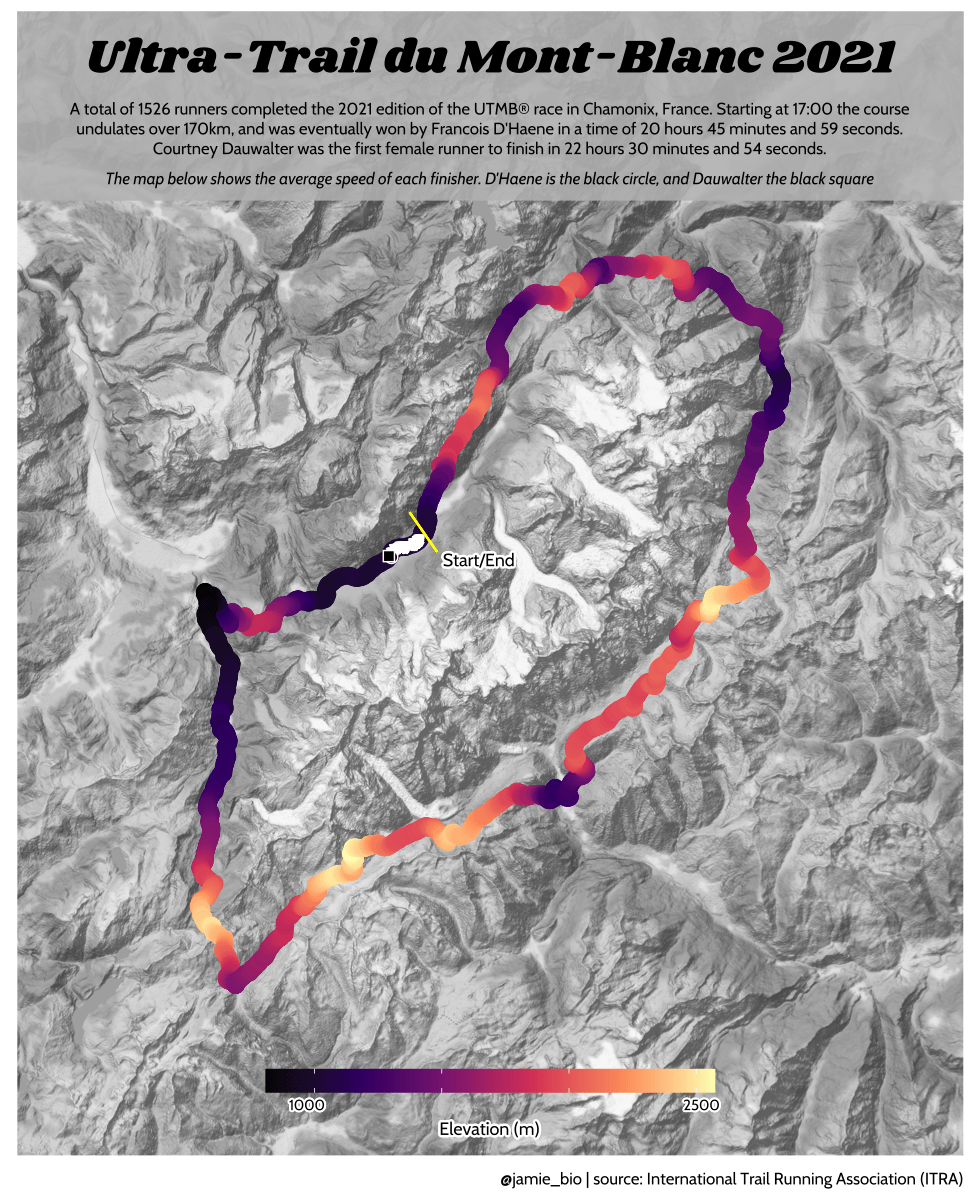 ] .pane[{Code} .overflow.fs-12.h100[ ```r # ultra_running.R # Jamie Hudson # Created: 27 October 2021 # Edited: 27 October 2021 # Data: Benjamin Nowak by way of International Trail Running Association (ITRA) # load libraries ------------------------------------------------------------ library(tidytuesdayR) library(tidyverse) library(janitor) library(ggmap) library(XML) library(gganimate) library(showtext) library(colorspace) library(ggtext) library(shadowtext) font_add_google("Cabin") font_add_google("Shrikhand") showtext_opts(dpi = 320) showtext_auto(enable = TRUE) # load dataset ------------------------------------------------------------ ultra_rankings <- readr::read_csv('https://t.co/JNJTpFTKqI?amp=1') %>% clean_names() race <- readr::read_csv('https://raw.githubusercontent.com/rfordatascience/tidytuesday/master/data/2021/2021-10-26/race.csv') # read in GTX data for UTMB course # code from Sascha Wolfer https://www.r-bloggers.com/2014/09/stay-on-track-plotting-gps-tracks-with-r/ # data from https://www.plotaroute.com/search?keyword=utmb options(digits=10) # Parse the GPX file pfile <- htmlTreeParse(file = "data/UTMB.gpx", error = function(...) { }, useInternalNodes = T) elevations <- as.numeric(xpathSApply(pfile, path = "//trkpt/ele", xmlValue)) times <- xpathSApply(pfile, path = "//trkpt/time", xmlValue) coords <- xpathSApply(pfile, path = "//trkpt", xmlAttrs) lats <- as.numeric(coords["lat",]) lons <- as.numeric(coords["lon",]) # wrangle data ------------------------------------------------------------ race_df <- full_join(ultra_rankings, race) utmb_21 <- race_df %>% filter(race_year_id == 72496) geodf <- data.frame(lat = lats, lon = lons, ele = elevations, time = times) lat <- c(min(geodf$lat) -0.06, max(geodf$lat) + 0.1) lon <- c(min(geodf$lon) - 0.1, max(geodf$lon) + 0.1) bbox <- make_bbox(lon,lat) geodf <- geodf %>% slice(which(row_number() %% 5 == 1)) utmb_times <- utmb_21 %>% dplyr::select(time_in_seconds) %>% mutate(pos = row_number()) %>% pivot_wider(names_from = pos, values_from = time_in_seconds) %>% slice(rep(1, each = nrow(geodf))) # function to repeat times n times rep.x <- function(x, na.rm=FALSE) (x / nrow(geodf) * row_number()) geodf_times <- cbind(geodf, utmb_times) %>% dplyr::select(-c("time")) %>% mutate_at(.vars = vars("1":"1526"), rep.x) %>% pivot_longer(-c(lon, lat, ele), names_to = "id", values_to = "time") %>% mutate(time = as.numeric(time)) # D'Haene and Dauwalter two_runners <- geodf_times %>% filter(id %in% c(1,7)) # dataframe of route route <- geodf %>% dplyr::select(lon, lat, ele) # download stamenmap for background map_background <- get_stamenmap(bbox, zoom = 12, source="stamen", maptype = "terrain-background", color="bw") # plot ------------------------------------------------------------ plot <- ggmap(map_background) + geom_path(data = route, mapping = aes(x = lon, y = lat, color = ele, group = 1), size = 4, lineend = "round") + scale_color_viridis_c(option = "magma") + geom_rect(xmin = 6.5, xmax = 7.3, ymin = 46.09, ymax = 46.2, fill = "grey", alpha = 0.4) + geom_jitter(geodf_times, mapping = aes(x = lon, y = lat, group = id), colour = "white", fill = "white", pch = 25, size = 0.4, width = 0.002, height = 0.002) + geom_jitter(two_runners, mapping = aes(x = lon, y = lat, group = id), colour = "white", fill = "black", pch = rep(c(21, 22), 2858), size = 2.5, width = 0.002, height = 0.002) + geom_segment(aes(x = route$lon[1] - 0.01, y = route$lat[1] + 0.01, xend = route$lon[1] + 0.01, yend = route$lat[1] - 0.01), colour = "yellow") + geom_shadowtext(label = "Start/End", x = route$lon[1] + 0.014, y = route$lat[1] - 0.014, size = 3, hjust = 0, family = "Cabin", check_overlap = TRUE, colour = "black", bg.colour = "white", bg.r = 0.2) + geom_shadowtext(label = "Elevation (m)", x = 6.917, y = 45.623, size = 3, hjust = 0.5, family = "Cabin", check_overlap = TRUE, colour = "black", bg.colour = "white", bg.r = 0.2) + geom_shadowtext(label = "1000", x = 6.785, y = 45.635, size = 2.5, hjust = 0.5, family = "Cabin", check_overlap = TRUE, colour = "black", bg.colour = "white", bg.r = 0.2) + geom_shadowtext(label = "2500", x = 7.07, y = 45.635, size = 2.5, hjust = 0.5, family = "Cabin", check_overlap = TRUE, colour = "black", bg.colour = "white", bg.r = 0.2) + guides(colour = guide_colorbar(title.position = 'bottom', title.hjust = 0.5, barwidth = unit(15, 'lines'), barheight = unit(0.8, 'lines'))) + annotate(geom = "text", label = "Ultra-Trail du Mont-Blanc 2021", x = 6.917, y = 46.162, size = 8, hjust = 0.5, family = "Shrikhand") + annotate(geom = "richtext", label = "A total of 1526 runners completed the 2021 edition of the UTMB® race in Chamonix, France. Starting at 17:00 the course \nundulates over 170km, and was eventually won by Francois D'Haene in a time of 20 hours 45 minutes and 59 seconds. \nCourtney Dauwalter was the first female runner to finish in 22 hours 30 minutes and 54 seconds.", x = 6.917, y = 46.125, size = 2.8, hjust = 0.5, family = "Cabin", fill = NA, label.color = NA) + annotate(geom = "richtext", label = "*The map below shows the average speed of each finisher. D'Haene is the black circle, and Dauwalter the black square*", x = 6.917, y = 46.1, size = 2.8, hjust = 0.5, family = "Cabin", fill = NA, label.color = NA) + labs(colour = "Elevation (m)", caption = "@jamie_bio | source: International Trail Running Association (ITRA)") + theme_minimal() + theme( axis.line = element_blank(), axis.text.x = element_blank(), axis.text.y = element_blank(), axis.ticks = element_blank(), axis.title.x = element_blank(), axis.title.y = element_blank(), panel.grid.major = element_blank(), panel.grid.minor = element_blank(), panel.border = element_blank(), plot.caption = element_text(family = "Cabin", size = 8), legend.position=c(0.5, 0.025), legend.justification = "bottom", legend.direction = "horizontal", legend.text = element_blank(), legend.title = element_blank()) anim <- plot + transition_reveal(time) animate(anim, nframes = 200, height = 8, width = 6.5, units = "in", res = 150) anim_save(paste0("ultra_running_", format(Sys.time(), "%d%m%Y"), ".gif")) ``` ] ] ] --- # Nice spider stuff .source[[Jamie Hudson <svg aria-hidden="true" role="img" viewBox="0 0 496 512" style="height:1em;width:0.97em;vertical-align:-0.125em;margin-left:auto;margin-right:auto;font-size:inherit;fill:currentColor;overflow:visible;position:relative;"><path d="M165.9 397.4c0 2-2.3 3.6-5.2 3.6-3.3.3-5.6-1.3-5.6-3.6 0-2 2.3-3.6 5.2-3.6 3-.3 5.6 1.3 5.6 3.6zm-31.1-4.5c-.7 2 1.3 4.3 4.3 4.9 2.6 1 5.6 0 6.2-2s-1.3-4.3-4.3-5.2c-2.6-.7-5.5.3-6.2 2.3zm44.2-1.7c-2.9.7-4.9 2.6-4.6 4.9.3 2 2.9 3.3 5.9 2.6 2.9-.7 4.9-2.6 4.6-4.6-.3-1.9-3-3.2-5.9-2.9zM244.8 8C106.1 8 0 113.3 0 252c0 110.9 69.8 205.8 169.5 239.2 12.8 2.3 17.3-5.6 17.3-12.1 0-6.2-.3-40.4-.3-61.4 0 0-70 15-84.7-29.8 0 0-11.4-29.1-27.8-36.6 0 0-22.9-15.7 1.6-15.4 0 0 24.9 2 38.6 25.8 21.9 38.6 58.6 27.5 72.9 20.9 2.3-16 8.8-27.1 16-33.7-55.9-6.2-112.3-14.3-112.3-110.5 0-27.5 7.6-41.3 23.6-58.9-2.6-6.5-11.1-33.3 2.6-67.9 20.9-6.5 69 27 69 27 20-5.6 41.5-8.5 62.8-8.5s42.8 2.9 62.8 8.5c0 0 48.1-33.6 69-27 13.7 34.7 5.2 61.4 2.6 67.9 16 17.7 25.8 31.5 25.8 58.9 0 96.5-58.9 104.2-114.8 110.5 9.2 7.9 17 22.9 17 46.4 0 33.7-.3 75.4-.3 83.6 0 6.5 4.6 14.4 17.3 12.1C428.2 457.8 496 362.9 496 252 496 113.3 383.5 8 244.8 8zM97.2 352.9c-1.3 1-1 3.3.7 5.2 1.6 1.6 3.9 2.3 5.2 1 1.3-1 1-3.3-.7-5.2-1.6-1.6-3.9-2.3-5.2-1zm-10.8-8.1c-.7 1.3.3 2.9 2.3 3.9 1.6 1 3.6.7 4.3-.7.7-1.3-.3-2.9-2.3-3.9-2-.6-3.6-.3-4.3.7zm32.4 35.6c-1.6 1.3-1 4.3 1.3 6.2 2.3 2.3 5.2 2.6 6.5 1 1.3-1.3.7-4.3-1.3-6.2-2.2-2.3-5.2-2.6-6.5-1zm-11.4-14.7c-1.6 1-1.6 3.6 0 5.9 1.6 2.3 4.3 3.3 5.6 2.3 1.6-1.3 1.6-3.9 0-6.2-1.4-2.3-4-3.3-5.6-2z"/></svg>](https://github.com/HudsonJamie/tidy_tuesday/tree/main/2021/week_50) and [Blake Mills <svg aria-hidden="true" role="img" viewBox="0 0 496 512" style="height:1em;width:0.97em;vertical-align:-0.125em;margin-left:auto;margin-right:auto;font-size:inherit;fill:currentColor;overflow:visible;position:relative;"><path d="M165.9 397.4c0 2-2.3 3.6-5.2 3.6-3.3.3-5.6-1.3-5.6-3.6 0-2 2.3-3.6 5.2-3.6 3-.3 5.6 1.3 5.6 3.6zm-31.1-4.5c-.7 2 1.3 4.3 4.3 4.9 2.6 1 5.6 0 6.2-2s-1.3-4.3-4.3-5.2c-2.6-.7-5.5.3-6.2 2.3zm44.2-1.7c-2.9.7-4.9 2.6-4.6 4.9.3 2 2.9 3.3 5.9 2.6 2.9-.7 4.9-2.6 4.6-4.6-.3-1.9-3-3.2-5.9-2.9zM244.8 8C106.1 8 0 113.3 0 252c0 110.9 69.8 205.8 169.5 239.2 12.8 2.3 17.3-5.6 17.3-12.1 0-6.2-.3-40.4-.3-61.4 0 0-70 15-84.7-29.8 0 0-11.4-29.1-27.8-36.6 0 0-22.9-15.7 1.6-15.4 0 0 24.9 2 38.6 25.8 21.9 38.6 58.6 27.5 72.9 20.9 2.3-16 8.8-27.1 16-33.7-55.9-6.2-112.3-14.3-112.3-110.5 0-27.5 7.6-41.3 23.6-58.9-2.6-6.5-11.1-33.3 2.6-67.9 20.9-6.5 69 27 69 27 20-5.6 41.5-8.5 62.8-8.5s42.8 2.9 62.8 8.5c0 0 48.1-33.6 69-27 13.7 34.7 5.2 61.4 2.6 67.9 16 17.7 25.8 31.5 25.8 58.9 0 96.5-58.9 104.2-114.8 110.5 9.2 7.9 17 22.9 17 46.4 0 33.7-.3 75.4-.3 83.6 0 6.5 4.6 14.4 17.3 12.1C428.2 457.8 496 362.9 496 252 496 113.3 383.5 8 244.8 8zM97.2 352.9c-1.3 1-1 3.3.7 5.2 1.6 1.6 3.9 2.3 5.2 1 1.3-1 1-3.3-.7-5.2-1.6-1.6-3.9-2.3-5.2-1zm-10.8-8.1c-.7 1.3.3 2.9 2.3 3.9 1.6 1 3.6.7 4.3-.7.7-1.3-.3-2.9-2.3-3.9-2-.6-3.6-.3-4.3.7zm32.4 35.6c-1.6 1.3-1 4.3 1.3 6.2 2.3 2.3 5.2 2.6 6.5 1 1.3-1.3.7-4.3-1.3-6.2-2.2-2.3-5.2-2.6-6.5-1zm-11.4-14.7c-1.6 1-1.6 3.6 0 5.9 1.6 2.3 4.3 3.3 5.6 2.3 1.6-1.3 1.6-3.9 0-6.2-1.4-2.3-4-3.3-5.6-2z"/></svg>](https://github.com/BlakeRMills/TidyTuesday)] 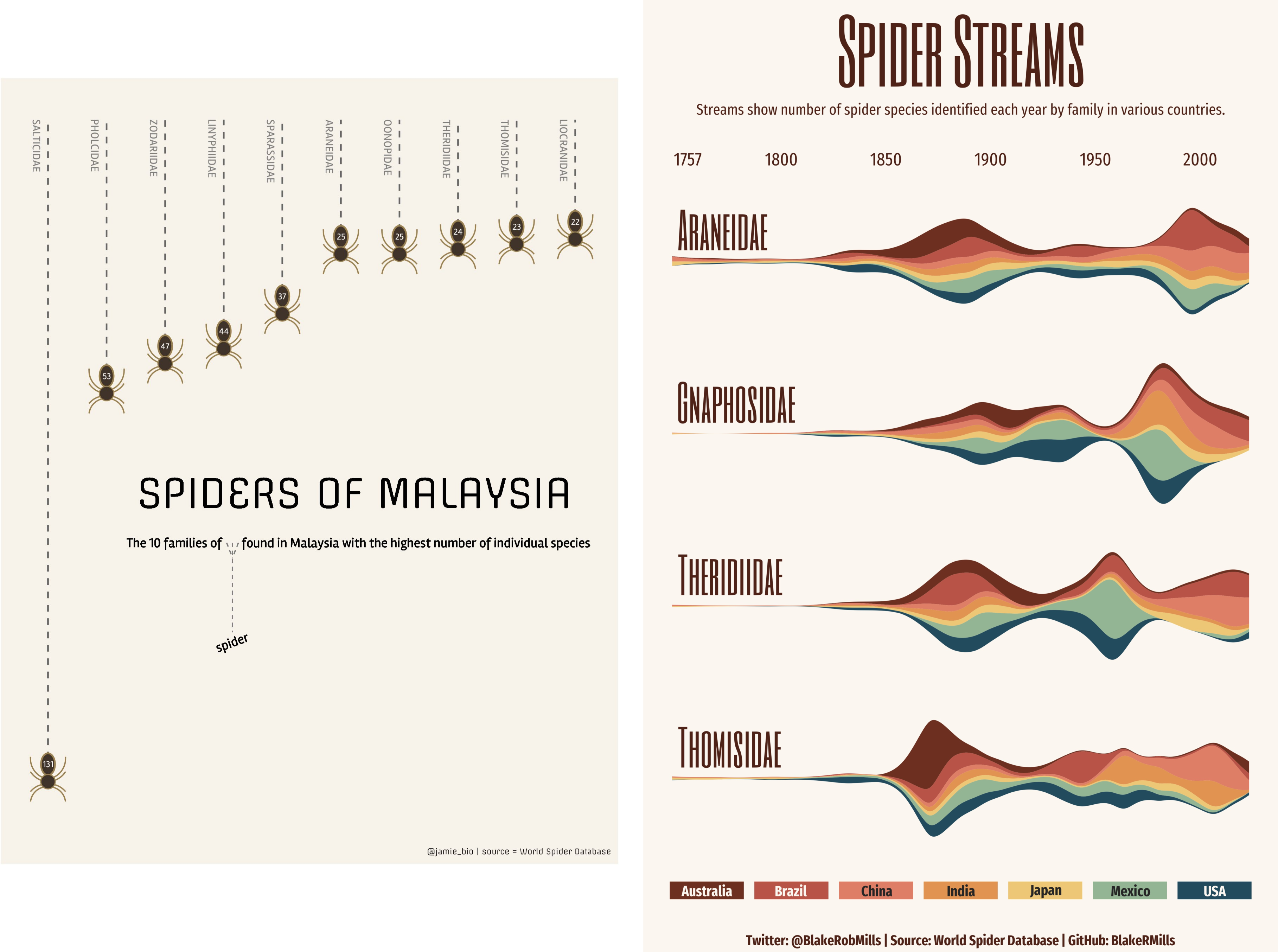 --- # Purpose of a graph Good graphs have a .it1[**main** purpose]. -- Main purposes: - looking nice - send a message - exploratory --- # Purpose of a *publication* graph Good graphs have a .it1[**main** purpose]. Main purposes: - .strike[looking nice] - send a message ( `\(=\)` we're here!) - .strike[exploratory] --- class: section # Graph theory --- # Publication graph ## What's the best graph? 1. informative ( `\(=\)` clear and not misleading) 2. pleasant -- ## But... - the medium should not take precedence on the content! - graphs which are too beautiful (too arty) distract the reader from the message ??? informative: get the information quickly and unambiguously pleasant: looks nice -- hard to tell stacking information is good but can reduce clarity there are ways to stack information w/t reducing too much clarity: colors / forms --- # The classic misleading graph .panelset[ .pane[{Problem?} .source[[the bird <i class="fab fa-twitter" role="presentation" aria-label="twitter icon"></i>](https://twitter.com/MatthewAKraft/status/1445424765125156872)] 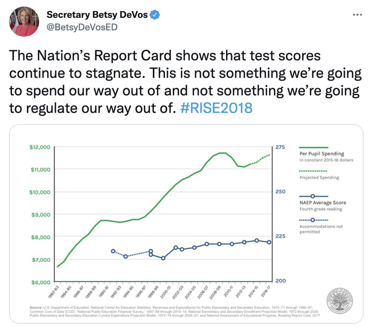 ] .pane[{Reply} .source[[the bird <i class="fab fa-twitter" role="presentation" aria-label="twitter icon"></i>](https://twitter.com/MatthewAKraft/status/1445424765125156872)] 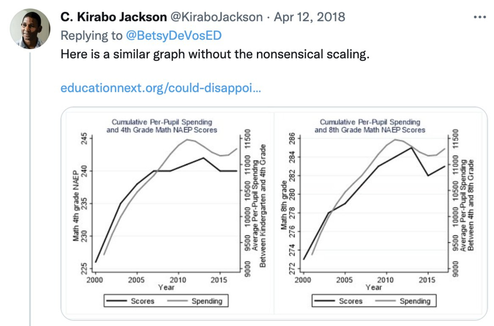 ] ] --- # Maybe too nice? .panelset[ .pane[{Basic} 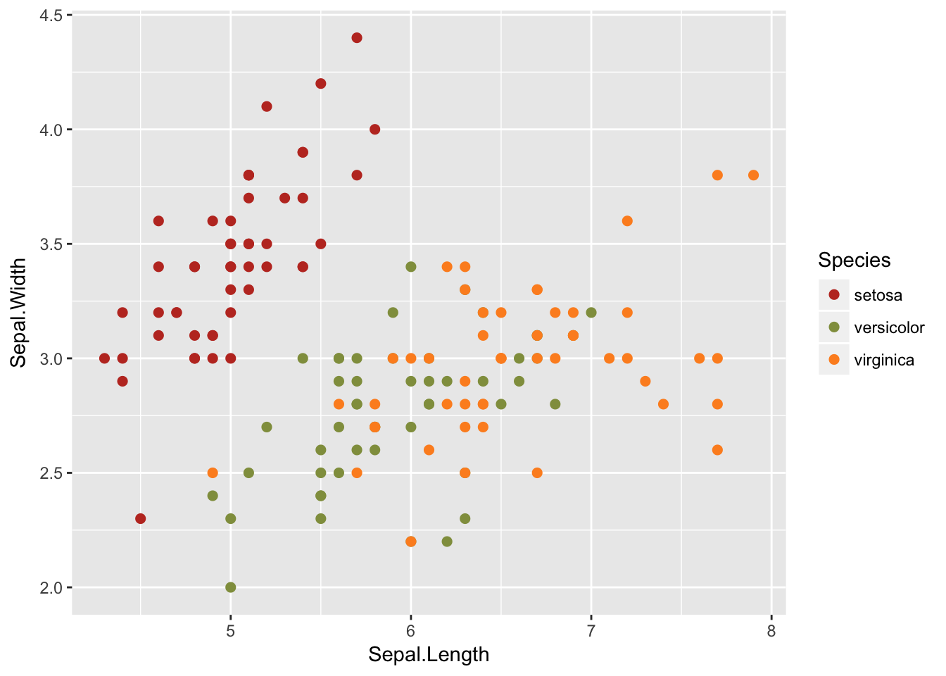 ] .pane[{Too nice?} 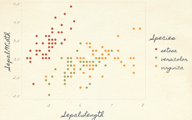 ] ] --- # The 3 components of a graph .fs-30[ 1. content 2. clarity 3. attractiveness ] --- # Content - the information you want to share/observe - typically: relationships, time series, consequence of events, conditional distributions - you can stack several content in the same graph --- # Clarity - how easy it is to understand the content - .it1[defined by its measure:] the time it takes to extract a piece of information `\(\Rightarrow\)` the lower the time, the higher the clarity --- # Attractiveness - is the graph pleasant to look at? - do you stare at it for its own sake? --- # Graphs as a maths problem ## Graph making is just about optimization ### Precision approach (us) $$ `\begin{eqnarray*} graph^{*} & = & \arg\max_{g}clarity\left(g\right)\\ & s.t. & content\left(g\right)\geq\tau \\ & & attractiveness\left(g\right)\geq\eta \end{eqnarray*}` $$ -- ### Infography approach $$ `\begin{eqnarray*} graph^{*} & = & \arg\max_{g}attractiveness\left(g\right)\\ & s.t. & content\left(g\right)\geq\tau\\ & & clarity\left(g\right)\geq\gamma \end{eqnarray*}` $$ --- # Tradeoffs - adding .it1[content] necessarily reduces .it1[clarity] (.color2[there are solutions to limit that]) - the relationship between .it1[attractiveness] and .it1[content]/.it1[clarity] is not clear. Graphs which are visually too attractive usually reduce clarity or weaken the message. --- # Example (iris again) .panelset[ .pane[{Graph 1}  ] .pane[{Criticism 1} .pull-left[  ] .pull-right[ - the contrast is so so due to the grey background: `\(\searrow\)` clarity - the colors are OK to identify the species - the grid helps to make comparisons between distant points `\(\Rightarrow\)` .it1[clarity] is OK overall but the .it1[attractiveness] is so so. We get that these variables are good to discriminate the species: .it1[content] is OK. ] ] .pane[{Graph 2}  ] .pane[{Criticism 2} .leftcol-40[  ] .rightcol.fs-15[ - font hard to read `\(\searrow\)` clarity - no grid `\(\searrow\)` clarity - it is visually attractive (.color2.fs-12[at least to me!]): - the font .color1[is nice] (.color2.fs-12[although hard to read]) - the background texture .color1[is nice] - the *pencil* look of the numbers/box .color1[is nice] - `\(=\)` it's .bold1[really nice]! `\(\Rightarrow\)` .it1[attractiveness] `\(+++\)` (.color2[to me!]). However, because there are so many nice things to look at, we lose track of the .it1[content]. The design choices, although great, reduce .it1[clarity] greatly. This is not a graph that you should put in your report! ] ] ] --- class: fs-30 # Golden rules of .strike[writing] graph making 1. Thou shalt not expect the reader to be interested in what you do -- 2. Thou shalt not expect the reader to spend more than 5 seconds on your graph --- # Lessons of the rules - .bold1[Clarity] is cardinal - what is this graph about? - what does it represent? - what's the value of that point? - a graph should be self explanatory -- - .bold1[Attractiveness] is important, but second tier - hooks the reader - makes the reader stay longer and maybe decide to put in some efforts to understand your graph ??? clarity: think it that way: there is a threshold of effort above which the reader will just stop attractiveness: that's why infographics in newspapers are so nice: to hook the uninterested reader --- # The reader as a shopper ### The money is the effort. The reader has little money. -- - .bold1[Clarity] `\(=\)` value for money - you can extract more content with lower effort - if you don't get much for your money, you just switch to another product -- - .bold1[Attractiveness]: increases the amount of money you wanna spend. It's the same effect as advertising: .versus[ .vs[.bold1[Buy that ticket to become a millionaire!]] .vs[.bold2[Buy that ticket and you may become a millionaire if you win a lottery with probability one over one billion.]] ] --- # Typology of graphs ### For publication (i.e. *for the world*) - low .it1[content]: to send a single or two messages - .it1[clarity] should be maximal: the reader must understand fast - high .it1[attractiveness]: to hook the reader -- ### For exploration (i.e. *for yourself*) - high .it1[content]: you want the most information in a single graph - tolerance for lower .it1[clarity]: you know what you're doing, that's the price to pay to dispose of more content in a single graph. Although you still need a minimum of clarity - .it1[attractiveness]: isn't the priority -- .h-25px[] .strong1[You still have the same optimization problem to solve but the thresholds are different!] --- class: section # How to solve the optimization </br> problem? --- .fs-30[ 1. content 2. clarity 3. .bold1[attractiveness] ] --- # Attractiveness - what is considered nice largely depends on a consensus which can evolve over time - it depends on preferences that vary between persons and even within persons (just have a look at your haircuts of 10 years ago!) - we won't cover attractiveness since we can't please everyone -- ### But... - there are guiding principles of proportions and colors - .color1[good news]: clear graphs usually look ok --- .fs-26[ 1. .bold1[content] 2. clarity 3. .strike[attractiveness] ] --- # Content - tailor your content, ask yourself: - is that information important? - what would the graph look like without it? - cut anything not necessary - add elements of context if needed (do they strengthen your point?) - is the graph faithful? - hierarchy of information! (the main message should be emphasized vàv other messages/the elements of context) - do I get the takeaway just from looking at the graph? Or do I need to read the text / get an oral explanation to get the central message? ??? next year => add examples for each of those cases => very important to add concrete example : make an exercise in class of having to graph an idea, and come with these concepts afterwards (so that the students can see what it really means) --- .fs-26[ 1. .strike[content] 2. .bold1[clarity] 3. .strike[attractiveness] ] --- class: section # Clarity --- # The good news .center.fs-30.bold1[There are many tips to make graphs clear!] --- class: fs-27 # What humans are good at - discerning colors -- - discerning shapes -- - heights comparisons -- .strong1[Let's leverage these three properties to make good graphs!] ??? graphe avec et sand grille horizontale graph étroit => OK grphe large => difficile de comparer --- # Colors - colors are .strong1[extremely powerful]: used properly, they add an extra layer of information without requiring any extra graph-space and have almost no processing cost for the reader -- .h-100px[] .center.strong1[Moral of the story: Abuse colors!] --- # Colors: what for? - two main uses of color: - to distinguish categories - to represent intensity -- - two different usages `\(=\)` two very different color picks! --- # Colors: OK, but which colors? ## Colors: a tricky topic! .block[{Resources, must read} - [How to pick more beautiful colors for your data visualizations](https://blog.datawrapper.de/beautifulcolors/) - [The HSB Color System: A Practitioner's Primer](https://learnui.design/blog/the-hsb-color-system-practicioners-primer.html) ] --- # Colors: a mini primer .leftcol-25[ Colors can be decomposed in - .bold1[H]ue - .bold1[S]aturation - .bold1[L]ightness ] -- .rightcol[ .bold1[Hue] - pure color .bold1[Saturation] - quantity of grey added to the color - .invisible[10]0: only grey - 100: no grey .bold1[Lightness] - quantity of black (<50) or white (>50) added to the color - .invisible[10]0: black - .invisible[1]50: pure color - 100: white ] --- # Colors: general rule ## Don't use pure colors! -- **.color-ff2200[They're a bit of an eyesore.] .color-22ff00[They're very bright, making them hard to read.] .color-fbff00[That's why I had to use a heavy font.].footnote[{`\\(\star\\)`}That's why I had to use a heavy font.] .color-0088ff[Note that the brightness depends on the hue: hues are not equal light-wise!]** -- **.color-cd4632[These are the same hues.] .color-4ac837[I've just reduced saturation.] .color-d7da25[The text is easier to read.]** .color-3684c9[I can even remove the heavy font!] --- # Colors: distinguishing categories - use colors that are "different" but have some harmony - how to find harmonious color sets? -- ### Don't do it yourself! - Adobe color website: [to create palettes](https://color.adobe.com/create/color-wheel) or [to find existing ones](https://color.adobe.com/explore) - [tons of color palettes in R](https://github.com/kylebutts/r-color-palettes) --- # Distinct colors: 3 rules ### General rules (.color2[and like French grammar, there are always exceptions!]) 1. use colors that are "clear-cut" (.color2[we keep colors in mind using their names, ex: using blue + mid-blue-mid-green + green makes it hard to remember]) -- 2. use different hues, not only different shades (.color2[shade variations are harder to remember and discern than hue variations; having both is even better]) -- 3. don't use colors to distinguish too many categories: - 2-4: best - .invisible[2-]5: to avoid, but can be OK if palette is good and depends on the graph - .invisible[2]>5: forget about it (.color2[too big a hit on clarity]) ??? 1) pple remind the colors with their names, hence a color that is mid blue/mid green is harder to remember that stg blue. IF TIME => show two palettes with these differences 2) Same comment, don't use shades of a same hue, light blue/dark blue => hard to remember IF TIME => show two palettes with these differences IF TIME: 4 panes: one with the names and associated colors, then the graph same set of two but with clear cut colors 3) What to do if I have 5+ categories to display? Cut content! In general, if you have a graph with 5+ categories to display, ask yourself if there's not a problem in terms of content --- # Distinct colors: Rule 3 OK, but what if I .strong1[really] have to display 6+ categories? -- .h-3em[]  --- # Distinct colors: Example .panelset[ .pane[{Graph 1} <!-- --> ] .pane[{Graph 2} <!-- --> ] ] --- # Colors: intensity Two main types of things to represent: - min-max: dichotomic representation (you can use >2 colors though) - negative-zero-positive: at least three colors (dichromatic works well) ??? A) things with positive values only: unemployment, earnings, whatever B) correlation, deviations from the mean, etc --- # Colors: intensity .panelset[ .pane[{Type of colors} 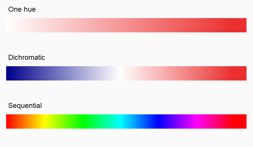<!-- --> ] .pane[{min-max} 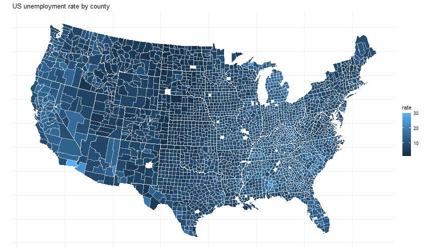<!-- --> ] .pane[{neg-0-pos} 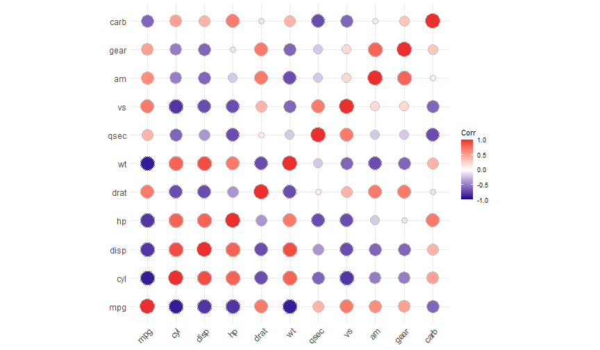<!-- --> ] ] --- # Color: Accessibility .source[[Briteweb](https://briteweb.com/tools/ada-compliance-color-palettes/)] - about 5% of the population is colorblind -- Consequence: 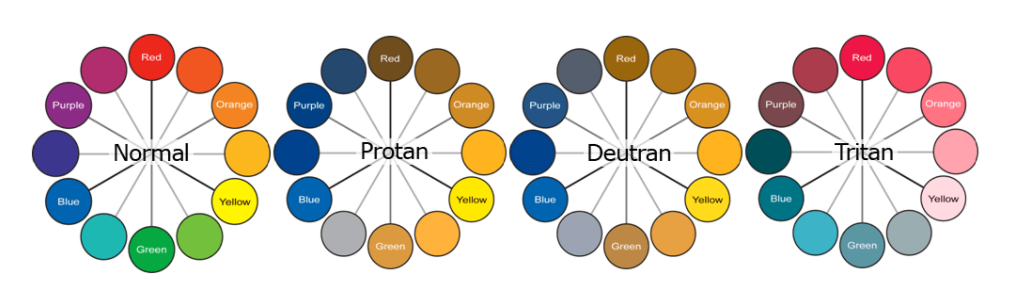 ??? Source for the numbers: https://www.colorblindguide.com/post/colorblind-people-population-live-counter mostly men: 8% women: 1/200 The main consequence is that there is no silver bullet to represent discrete color points --- # Color accessibility in R Two dedicated packages (among others): - [scico](https://github.com/thomasp85/scico) (stands for **sci**entific **co**lors) - [viridis](https://sjmgarnier.github.io/viridis/index.html) --- # Color accessibility .panelset[ .pane[{scico} 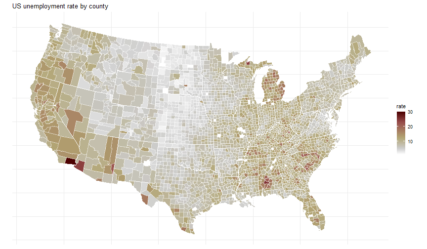<!-- --> ] .pane[{viridis} 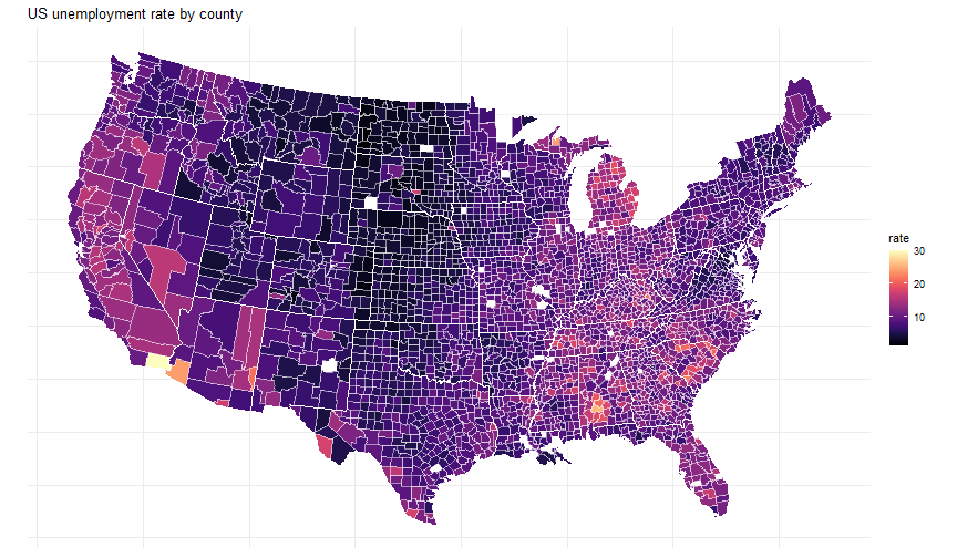<!-- --> ] ] --- # Shapes - it's fairly easy for humans to discern shapes - however it's more difficult and less automatic than for colours - add shapes in scatterplots in conjunction with colours to facilitate reading - very useful in B&W --- # Shapes: example .panelset[ .pane[{Shape} 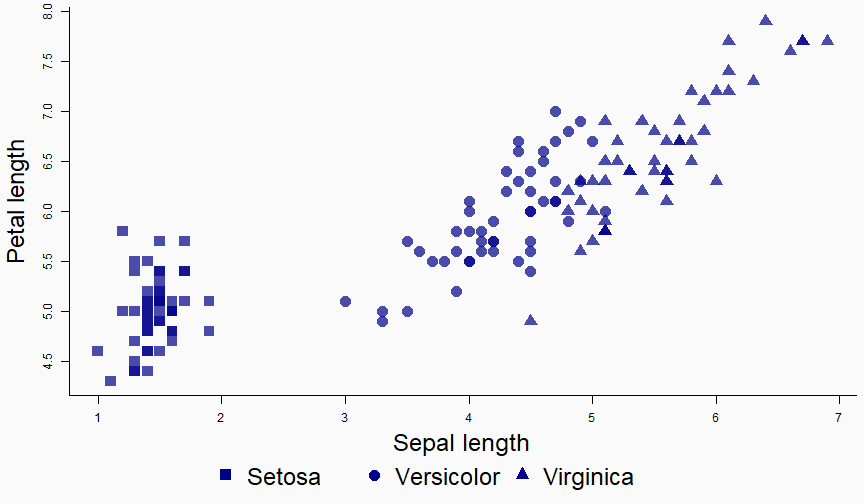<!-- --> ] .pane[{Sh. + Col.} 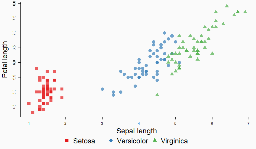<!-- --> ] .pane[{BW} <!-- --> ] .pane[{BW + Sh.} <!-- --> ] ] --- # Harnessing visual perception - humans are pretty good at comparing heights and widths - in contrast, they're pretty bad at comparing surfaces `\(\Rightarrow\)` use bars to compare numbers, use a grid to help make comparisons --- # Comparisons: Example .panelset[ .pane[{Difficult} Can you see a difference? <!-- --> ] .pane[{Easy} Exactly the same data... incomparably easier to read. <!-- --> ] ] ??? Pie charts can be good to show big discrepancies--but that's illustration then. For precise statistical graphs, forget about it. --- If you have many categorical values to display, vertical bar graphs can be good. .source[[ggpubr](http://www.sthda.com/english/articles/24-ggpubr-publication-ready-plots/)] <!-- --> ??? although too much content will always be hard to read. The solution is to cut out the cars that are not important in our study or make a single group of them. => In the future I should also take care of explaining how to curate the content to sharpen the message. --- class: section # Clarity: Helping the reader --- # Helping the reader - the data in your graph is central - the text describing the graph is not less central! -- .h-2em[] .center.strong1[Without description, a graph is worthless!] --- # Describing a graph: First commandment .block[{First commandment} You must .color1[absolutely] .bold1[ALWAYS] label your axes, or else you'll endure divine wrath!.footnote[A few exceptions exist, like for dates which are self-explanatory. But even then writing it doesn't hurt.] ] --- # Describing a graph: Other main textual components - the legend, if there are 2+ types of data - the title.footnote[Note that the title can be redundant with the caption in the document, in which case it is possible to remove it; although, even then, a short title in the graph never hurts.] -- .block[{To keep in mind} Text takes space, and space is limited! The text should be as short as possible while remaining as informative as possible.] --- # Helping the reader: Tips - .color1[the text must be read easily]: readable font + min. font size -- - .color1[hierarchy]: the explanations should not take more space than the data. More important information should be more emphasized. -- - .color1[repeat information] -- - .color1[add a grid when relevant] -- - .color1[minimize the distance between the legend and the data]: especially with 4+ categories --- # Making the text easy to read 1. you must choose a readable font 2. ensure the size of the text is easily readable (but not too big) --- # Font family .panelset[ .pane[{Font families} There are three main font families: .fs-26[ - <span style="font-family:serif"> serif </span> - <span style="font-family:sans-serif">sans-serif</span> - <span style="font-family:monospace">monospace</span> ] - .color1[sans-serif] are recognized as the font family with the highest readability - in general, don't use .color2[serif] fonts in graphs. - .color2[mono] fonts can be nice when you have words with the same size that stack (like country codes) ] .pane[{showtext} In `R` you can change the font in graphs with [showtext](https://cran.rstudio.com/web/packages/showtext/vignettes/introduction.html): ```r pacman::p_load(showtext) font_add_google("Fira Code", "fira") font_add_google("Merriweather", "merri") showtext_auto() plot(iris$Petal.Length, iris$Sepal.Length, col = iris$Species, pch = 16, bty = "L", ann = FALSE) title(xlab = "Petal length (default sans serif)", cex.lab = 1.2) title(ylab = "Sepal length (serif: Merriweather)", family = "merri", cex.lab = 1.2) mtext(text = "Three varieties of iris flowers (mono: Fira Code)", side = 3, line = 1, font = 2, adj = 0, cex = 1.7, family = "fira") ``` ] .pane[{Graph} 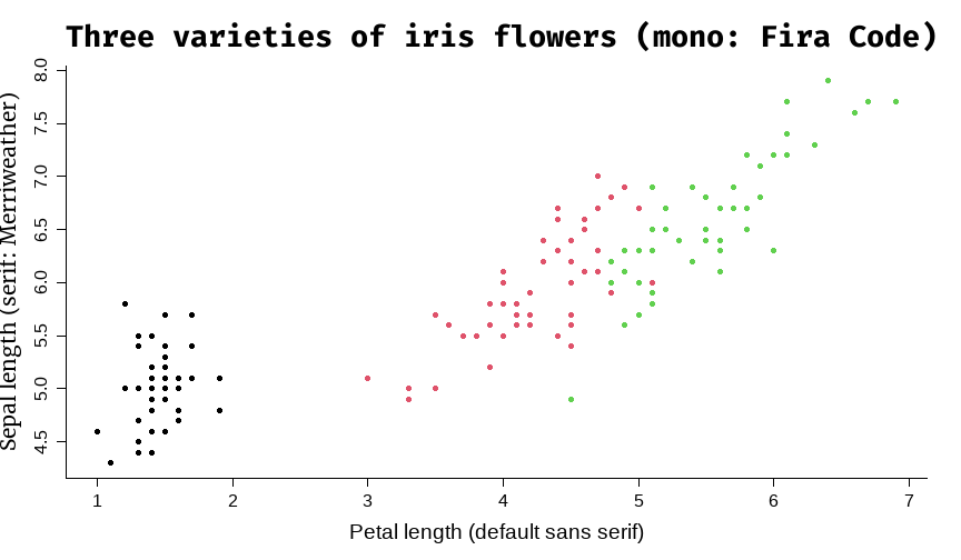<!-- --> ] ] --- # Font size - do you think that once you find a graph displaying nicely on your screen, you can just `ggsave` it and it will be fine? -- .h-1em[] .center.strong1.fs-30[Think twice!] .h-1em[] -- - the final location of your graph is your document, not your screen! - the graph will be rescaled to fit its width in the document `\(\Rightarrow\)` the font may become too small! --- # Font size: A helper function Some functions may help you to deal with that: `pdf_fit`/`png_fit` from [fplot](https://cran.r-project.org/web/packages/fplot/index.html): - use `setFplot_page` to define the size of the final document if needed (by default it's an A4 page with some usual margins) ```r # starts recording. # - pt = 11 will save the graph with 11pt font size # - w2h = 1.75 means that the width to height ratio is 1.75 (wide graph) pdf_fit("path.pdf", pt = 11, w2h = 1.75) # your graph # ends recording. # The final look of your graph is displayed in the viewer pane fit_off() ``` --- # Repeat + grid: An example <!-- --> --- # Minimize the legend-to-data distance .panelset[ .pane[{Difficult} <!-- --> ] .pane[{Easy} <!-- --> ] ] --- # Can you spot the problems? .panelset[ .pane[{Context} .h-1em[] I will show you a graph coming from a top (.bold1[top]) publication. .h-1em[] The research was careful and the results are of great relevance: there is no doubt on the quality and the importance of the research done. .h-1em[] Despite the stellar work, the graphs could be improved (i.e. `\(\nearrow\)` clarity), at no cost. ] .pane[{The graph} 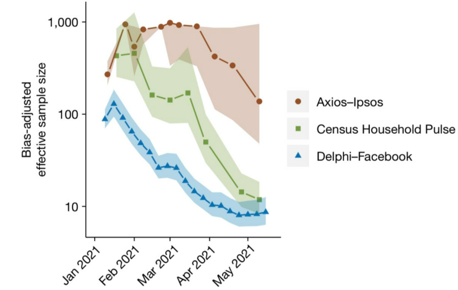 ] .pane[{Criticism} .leftcol-25[  ] .rightcol[ Among others... .block[{Major} The legend takes as much space as the graph!!!!!!!! (.color2[it burned my eyes!]) ] .block[{Minor} Adding a light grid would facilitate the reading, it's almost impossible to compare points. ] ] ] ]