class: center, middle, inverse, title-slide # Data analysis II ## Visualisation, practice ### Laurent Bergé ### University of Bordeaux, BxSE ### 09/12/2021 --- class: fs-28 # Outline 1. Intro 2. [A bit of graphical code in R](#sec_r_code) 3. [A functional approach to graphs](#sec_functional) 4. [More graphical code in R](sec_r_more) --- # A tale of two paths... 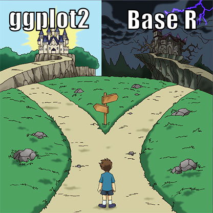 --- # Pros and cons: Base R .pull-left[ ### Pros - the principle is easy to grasp: we simply overlay successive forms on top of each other - low level operations `\(=\)` everything is possible ] -- .pull-right[ ### Cons - because everything is an overlay on stg already in place, the first plot is critical: you need to plan everything in advance!!! .color2.fs-18[Doing simple stuff can be surprisingly difficult.] - many commands which are not really intuitive. .color2.fs-18[After 10 years, I still look up `?par` regularly.] ] --- # Messing up the first plot in Base R You miss most of the show! 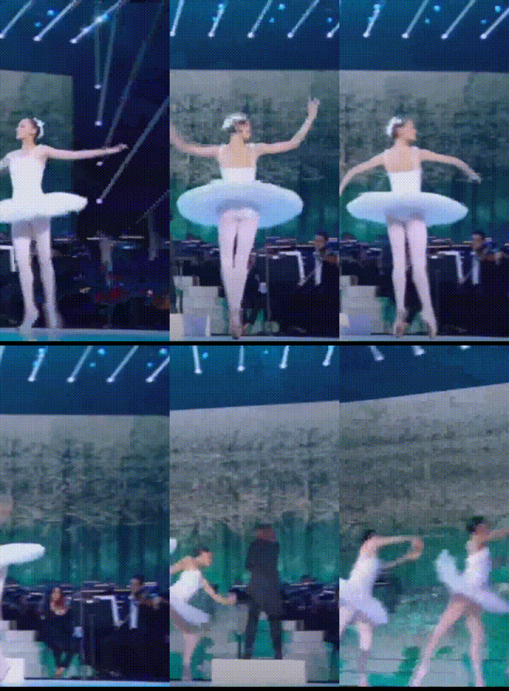 --- # Disclaimer I'm a `ggplot2` noob, base R is my home. I have a lot of sympathy for it.  --- # Pros and cons: ggplot2 .pull-left[ ### Pros - much more user friendly: stacks all your layers before creating the graph and makes all the computations for you. .color2.fs-18[You don't need to overthink how to set the stage any more.] - millions of contributed packages ] -- .pull-right[ ### Cons - since there is pre-processing, it is sometimes difficult to do exactly what you want (e.g. for a very precise publication graph). .color2.fs-18[To be confirmed, it's only second-hand experience!] ] --- # Wait! There are other paths!  --- # Ready made solutions - there are numerous packages out there which make good graphs with a user-friendly interface (ie with minimal user input) - example: [ggpubr](https://rpkgs.datanovia.com/ggpubr/index.html) or [fplot](https://cran.r-project.org/web/packages/fplot/index.html) for distributions; [ggcorrplot](https://cran.r-project.org/web/packages/ggcorrplot/index.html) for correlations; [highcharter](https://jkunst.com/highcharter/) for many things, etc. --- # Pros and cons: Ready made solutions .leftcol[ ### Pros - in a single line of code you get a graph of (.color2[usually]) very decent quality - very good for exploratory graphs ] -- .rightcol[ ### Cons - the level of customization is limited, this is especially problematic for presentations/publications in which you want a very high level of customization ] --- # Direct edition - I strongly encourage you to learn how to work with [inkscape](https://inkscape.org/).footnote[{`\\(\star\\)`}Or any equivalent image edition software, but .color1[inkscape] is both free and powerful (.color2[yeah!]).] - it's just crazy how fast you can edit/create images - that's indispensable in your skill set, you'll save so much time! ??? later: add gif edition of the castle image --- # Pros and cons: Direct edition .leftcol[ ### Pros - you can do exactly what you want, as precisely as you want - with practice, you can edit very rapidly ] -- .rightcol[ ### Cons - the direct edition only comes after the first creation of the graph: hence you have to navigate across software - cannot be automated: all the work that you do with one graph, you'd have to do it again for a graph with new data ] --- name: sec_r_code class: section # Short introduction to Base R --- # Data content R dispose of multiple functions to display data: - `plot()`: CORE graphical function - `points()`, `lines()`, `abline()`, `text()`: used to plot additional data - `density()`, `hist()`, `boxplot()`, etc... --- # Plot - The function `plot()` is the main graphical function of R (more precisely, it's a method). - By default it is a scatterplot between two variables, but it can be used to do much more than that. - Some functions preprocess the data, like `density()`, and modify completely the behavior of `plot()` when you apply it to the preprocessed data. More on that later. - When you apply `plot()`, it creates a new graphic and the previous one is lost (of course there are exceptions...). To add several pieces of information, you'll need to use other functions. --- # Main `plot` arguments Main plot arguments relating to data: - `x, y`: the data - `xlim, ylim`: the limits of the plotting region - `col, pch, lty, lwd`: color, symbol, line type and line width - `type`: the type of plot - `log`: whether to put the x/y axes to logarithm --- # Plot: type <!-- --> --- # Plot: type = "n" Using `type = "n"` hides the data, but EVERYTHING else is there. Can be useful when constructing complex graphics: i.e. when setting the stage. ```r plot(1:5, type = "n") ``` <!-- --> --- # Plot: limits <!-- --> --- # Plot: pch ```r plot(1:20, pch = 1:20) grid() ``` <!-- --> --- # Plot: cex ```r plot(1:5, pch = 16, cex = 1:5, main = "cex: modify point size") ``` <!-- --> --- # Plot: lty and lwd <!-- --> --- # Plot: col I <!-- --> --- # Plot: col II Lot of color possibilities: - Custom colors: `rgb()`,`hsv()`, etc - "Nice" colors: package `RColorBrewer` - Color interpolation: - `rainbow(n)`, `heat.colors(n)`, etc, create vectors of `n` colors. - `colorRampPalette(c("white", "blue"))(5)`: create a vector of 5 colors between the colors white and blue. - Nice introduction to R colors in the [R-stats UBC course](https://stat545.com/colors.html) --- # Exercise: Plot Generate a 100 periods Brownian motion `\(x_{t+1} = x_{t} + \epsilon_{t}\)`, `\(\epsilon_{t}\sim N(0,1)\)`. 1. Plot its evolution with both a solid line and filled points (in the same graph). 2. This time display only the points and use the function `rainbow()` to set the color of each point. --- # Adding data points To add points/lines onto an existing plot: - `lines()` - `points()` It behaves as the function `plot()` and contains the same arguments (col, lty, cex, lwd, pch). --- # Lines & points ```r plot(1:5, ylim = c(-2, 5)) lines(1:5 - 1) points(1:5 - 2) ``` <!-- --> --- # Exercise: Plot & line In the following graph, the functions `plot()`, `lines()` and `points()` have been called. Can you say to what command refers each graphical information, and in what order they have been called? <!-- --> --- # Exercise: Plot & lines Re-generate the previous Brownian motion. 1. Plot it with both line and dots. 2. Generate another Brownian motion with `\(\epsilon_{t}\sim N(0, 4)\)`. Plot the two motions on a single graph, the second one should be of `"firebrick"` color, have thick and dashed line and be of triangle symbol. --- # abline I The function `abline()` draws lines. Its arguments are: - `h`: coordinate of horizontal line - `v`: coordinate of vertical line - `a, b`: intercept (a) and slope of a straight line. Shorthan exist: can take the result of an OLS regression (function `lm()`) instead. --- # abline II ```r plot(iris$Sepal.Length, iris$Petal.Width) abline(lm(Petal.Width ~ Sepal.Length, iris)) abline(h = c(1, 2), v = c(5, 7), col = "gray", lty = 3) ``` <!-- --> --- # Exercise: abline You want to illustrate the relation between the variables "Sepal.Length" and "Petal.Width" for each species of the `iris` data. 1. Plot the scatterplot between the two variables with one color per species. 2. Draw the regression lines for each group with the appropriate color. --- # Text I You can add text to an existing plot with the function `text()`. The most important arguments are: - x, y: coordinates of the text - labels: the text to be displayed - pos: the position of the text relative to the coordinate. pos = 0: as is, pos = 1: below, 2: left, 3: top, 4: right. - As usual, other graphical parameters apply: cex (size), col, etc. --- # Text II ```r plot(5:1, col = "firebrick", pch = 18, xlim = c(0, 6)) text(1, 5, "pos = default") text(2:5, 4:1, paste0("pos = ", 1:4), pos = 1:4) ``` <!-- --> --- # Exercise: text 1. As in the previous exercise, plot the scatterplot between the two variables with one color per species for the variables "Sepal.Length" and "Petal.Width" of the `iris` data. 2. Add the Species names *in the middle* of the points for each species in the right color and with large font. --- name: sec_functional class: section # A functional approach to graphs --- # From pain we learn Base R can be surprisingly painful for doing seemingly simple stuff. .block[Q: What does a programmer do when facing a tedious task?] -- .block[A: S/he automates it!] -- Base R is so painful, that if you stick to it, it will make you a good programmer (or a masochist!). Remember though: it's not just painful, it's also .bold1[extremely powerful]! --- # Hard coding It's very easy to write code that is specific to your current data! In fact, it's usually the first thing we do, and it works well. -- .leftcol-45.fs-12[ ```r plot(iris$Petal.Length, iris$Sepal.Length, col = iris$Species, pch = 20, cex = 2) text(1.5, 5, "Setosa", font = 2, cex = 4) text(4, 6, "Versicolor", font = 2, cex = 4, col = 2) text(6, 7, "Virginica", font = 2, cex = 4, col = 3) ``` ] .rightcol[ <!-- --> ] --- # Hard coding: The problem If your data changes, even slightly, your code is messed up. Changing `Sepal.Length` into `Sepal.Width` loses the legend: .leftcol-45.fs-12[ ```r plot(iris$Petal.Length, iris$Sepal.Width, col = iris$Species, pch = 20, cex = 2) text(1.5, 5, "Setosa", font = 2, cex = 4) text(4, 6, "Versicolor", font = 2, cex = 4, col = 2) text(6, 7, "Virginica", font = 2, cex = 4, col = 3) ``` ] .rightcol[ <!-- --> ] --- # Hard coding: The problem If your data changes, even slightly, your code is messed up. .block[{To remember} The data **always** changes!] --- # Hard coding: The routine If you want to replicate a hard coded graph to a new data set you: 1. copy paste the code 2. change the data 3. make the adjustments so the graph looks as you wish with the new data -- I think I don't need to write that each of these three steps are .bold1[highly error-prone], and can cost dearly..footnote[{`\\(\star\\)`} Think of the situation where you advise your boss based on a graph, only to realize a couple of hours later that you simply badly updated a copy-pasted piece of code... .color2[and off you go!]] --- # Hard coding: The solution - very simple: don't hard code! <svg aria-hidden="true" role="img" viewBox="0 0 496 512" style="height:1em;width:0.97em;vertical-align:-0.125em;margin-left:auto;margin-right:auto;font-size:inherit;fill:currentColor;overflow:visible;position:relative;"><path d="M248 8C111 8 0 119 0 256s111 248 248 248 248-111 248-248S385 8 248 8zm0 448c-110.3 0-200-89.7-200-200S137.7 56 248 56s200 89.7 200 200-89.7 200-200 200zm117.8-146.4c-10.2-8.5-25.3-7.1-33.8 3.1-20.8 25-51.5 39.4-84 39.4s-63.2-14.3-84-39.4c-8.5-10.2-23.7-11.5-33.8-3.1-10.2 8.5-11.5 23.6-3.1 33.8 30 36 74.1 56.6 120.9 56.6s90.9-20.6 120.9-56.6c8.5-10.2 7.1-25.3-3.1-33.8zM168 240c17.7 0 32-14.3 32-32s-14.3-32-32-32-32 14.3-32 32 14.3 32 32 32zm160-60c-25.7 0-55.9 16.9-59.9 42.1-1.7 11.2 11.5 18.2 19.8 10.8l9.5-8.5c14.8-13.2 46.2-13.2 61 0l9.5 8.5c8.5 7.4 21.6.3 19.8-10.8-3.8-25.2-34-42.1-59.7-42.1z"/></svg> -- - OK, here comes some tips --- # Tip 1: Define global variables! - whenever a variable is repeated *twice*, use a global variable.footnote[Uppercase letters work well to identify parameters.] defined at the beginning of the piece of code -- .leftcol[ .bold1[BAD] .fs-14[ ```r plot(iris$Petal.Length, iris$Sepal.Width, col = iris$Species, pch = 20, cex = 2) text(1.5, 5, "Setosa", font = 2, cex = 4) text(4, 6, "Versicolor", font = 2, cex = 4, col = 2) text(6, 7, "Virginica", font = 2, cex = 4, col = 3) ``` ] ] .rightcol[ .bold1[GOOD] .fs-14[ ```r FONT = 2 CEX = 4 plot(iris$Petal.Length, iris$Sepal.Width, col = iris$Species, pch = 20, cex = 2) text(1.5, 5, "Setosa", font = FONT, cex = CEX) text(4, 6, "Versicolor", font = FONT, cex = CEX, col = 2) text(6, 7, "Virginica", font = FONT, cex = CEX, col = 3) ``` ] ] --- # Tip 2: Lay bare how you think! - when you decide to place some text here, or a legend there, how do you take the decision? - you decide based on heuristics (.color2[although you may not even notice there was a decision process!]) -- - the game is to extract the (often implicit) rules that made you take a decision.footnote[{`\\(\star\\)`} You can .color1[always] find an heuristic that led to your decision.] - if you achieve to make the heuristic explicit: you win since now you can automatize it! --- # Tip 2: Lay bare how you think! Remember when I asked to put the names *in the middle* of the points? .block[Q: What does *in the middle* means mathematically?] -- .block[A: The barycenter!] -- .leftcol[ .bold1[BAD] .fs-13[ ```r FONT = 2 CEX = 4 plot(iris$Petal.Length, iris$Sepal.Width, col = iris$Species, pch = 20, cex = 2) text(1.5, 5, "Setosa", font = FONT, cex = CEX) text(4, 6, "Versicolor", font = FONT, cex = CEX, col = 2) text(6, 7, "Virginica", font = FONT, cex = CEX, col = 3) ``` ] ] .rightcol[ .bold1[GOOD] .fs-13[ ```r FONT = 2 CEX = 4 plot(iris$Petal.Length, iris$Sepal.Width, col = iris$Species, pch = 20, cex = 2) bary = aggregate(cbind(Petal.Length, Sepal.Width) ~ Species, iris, mean) text(bary[1, 2], bary[1, 3], "Setosa", font = FONT, cex = CEX) text(bary[2, 2], bary[2, 3], "Versicolor", font = FONT, cex = CEX, col = 2) text(bary[3, 2], bary[3, 3], "Virginica", font = FONT, cex = CEX, col = 3) ``` ] ] --- # Tip 3: Loop whenever possible! - whenever you repeat two statements: use a loop instead! -- .leftcol[ .bold1[BAD] .fs-13[ ```r FONT = 2 CEX = 4 plot(iris$Petal.Length, iris$Sepal.Width, col = iris$Species, pch = 20, cex = 2) bary = aggregate(cbind(Petal.Length, Sepal.Width) ~ Species, iris, mean) text(bary[1, 2], bary[1, 3], "Setosa", font = FONT, cex = CEX) text(bary[2, 2], bary[2, 3], "Versicolor", font = FONT, cex = CEX, col = 2) text(bary[3, 2], bary[3, 3], "Virginica", font = FONT, cex = CEX, col = 3) ``` ] ] .rightcol[ .bold1[GOOD] .fs-13[ ```r FONT = 2 CEX = 4 plot(iris$Petal.Length, iris$Sepal.Width, col = iris$Species, pch = 20, cex = 2) categ_val = levels(iris$Species) for(i in seq_along(categ_val)){ data = iris[iris$Species == categ_val[i], ] text(mean(data$Petal.Length), mean(data$Sepal.Width), categ_val[i], font = FONT, cex = CEX, col = i) } ``` ] ] --- # Tip 4: Loop over the tips! Apply recursively .strong1[Tip 1], .strong1[Tip 2] and .strong1[Tip 3] until you can't any more. -- .leftcol[ .bold1[BAD] .fs-13[ ```r FONT = 2 CEX = 4 plot(iris$Petal.Length, iris$Sepal.Width, col = iris$Species, pch = 20, cex = 2) categ = levels(iris$Species) for(i in seq_along(categ)){ data = iris[iris$Species == categ[i], ] text(mean(data$Petal.Length), mean(data$Sepal.Width), categ[i], font = FONT, cex = CEX, col = i) } ``` ] ] .rightcol[ .bold1[GOOD] .fs-13[ ```r FONT = 2 CEX = 4 x = iris$Petal.Length y = iris$Sepal.Width categ = iris$Species plot(x, y, col = categ, pch = 20, cex = 2) categ_val = levels(categ) for(i in seq_along(categ_val)){ who = categ == categ_val[i] text(mean(x[who]), mean(y[who]), categ_val[i], font = FONT, cex = CEX, col = i) } ``` ] ] --- # Are the tips useful? Can those tips be concretely helpful? To know that, let's summon the .bold1[copy-paste demon]. --- # Code without tips ```r plot(iris$Petal.Length, iris$Sepal.Width, col = iris$Species, pch = 20, cex = 2) text(1.5, 5, "Setosa", font = 2, cex = 4) text(4, 6, "Versicolor", font = 2, cex = 4, col = 2) text(6, 7, "Virginica", font = 2, cex = 4, col = 3) ``` --- # Code without tips: Summoning  --- # Code without tips: Outcome The demon has .bold1[immense powers] .leftcol[  ] .rightcol[  ] --- # Code with tips ```r FONT = 2 CEX = 4 x = iris$Petal.Length y = iris$Sepal.Width categ = iris$Species plot(x, y, col = categ, pch = 20, cex = 2) categ_val = levels(categ) for(i in seq_along(categ_val)){ who = categ == categ_val[i] text(mean(x[who]), mean(y[who]), categ_val[i], font = FONT, cex = CEX, col = i) } ``` --- # Code with tips: Summoning  --- # Code with tips: Outcome The demon is .bold1[weak] .leftcol[  ] .rightcol[  ] --- # Tips: Side benefits If you've followed the tips, guess what: -- .center[.strong1[You can create a function for your graph .underline[for free]!]] -- .leftcol-41[ .bold1[Before] .fs-11[ ```r FONT = 2 CEX = 4 x = iris$Petal.Length y = iris$Sepal.Width categ = iris$Species plot(x, y, col = categ, pch = 20, cex = 2) categ_val = levels(categ) for(i in seq_along(categ_val)){ who = categ == categ_val[i] text(mean(x[who]), mean(y[who]), categ_val[i], font = FONT, cex = CEX, col = i) } ``` ] ] .rightcol[ .bold1[After] .fs-13[ ```r scatter_name = function(x, y, categ, font = 2, cex = 4){ plot(x, y, col = categ, pch = 20, cex = 2) categ_val = levels(categ) for(i in seq_along(categ_val)){ who = categ == categ_val[i] text(mean(x[who]), mean(y[who]), categ_val[i], font = font, cex = cex, col = i) } } scatter_name(iris$Petal.Length, iris$Sepal.Width, iris$Species) ``` ] ] --- # Why create functions to make graphs? 1. guards you against, or limits, copy-paste problems -- 1. facilitates graph replications -- 1. you don't have to think to implementation details when running the function (.color2[reduces mental load]) -- 1. it's very easy to include new features to the functions, and all the calls benefit from it --- # Mental load Code telling .bold1[.underline[what] you do] and **not** .bold1[.underline[how] you do it] increases productivity tremendously. -- .leftcol[ .fs-15[ ```r FONT = 2 CEX = 4 x = iris$Petal.Length y = iris$Sepal.Width categ = iris$Species plot(x, y, col = categ, pch = 20, cex = 2) categ_val = levels(categ) for(i in seq_along(categ_val)){ who = categ == categ_val[i] text(mean(x[who]), mean(y[who]), categ_val[i], col = i, font = FONT, cex = CEX) } ``` ] ] .rightcol[ .fs-15[ ```r scatter_name(iris$Petal.Length, iris$Sepal.Width, iris$Species) ``` ] ] -- The code on the right will .bold1[always be easier to understand] than the code on the left..footnote[{`\\(\\star\\)`} If in doubt, you just have to jump to the function definition and its associated documentation (.color2[that you didn't forget to write of course!]).] --- # Why not create functions? 1. you have a presentation in 30 minutes and have to finish that graph -- 1. you're making a graph that you think will never replicate.footnote[{`\\(\\star\\)`} Note that this assumption is in general false. What we think is specific is often but an instance of a more general problem.] -- 1. the graph is really simple (.color2[in terms of lines of code!]) --- # Functions: Summary - thinking in functions will change the way you code - it will clarify your code: it will be easier to understand and share, and less error-prone - due to the .color1[high fixed costs, 0 marginal cost] nature of functions, you'll gain *a lot* of productivity --- # Functional programming: Application Remember the scatterplot with different colors and a linear fit? Let's redo it. 1. plot the scatterplot between the variables "Sepal.Length" and "Petal.Width" for each species of the `iris` data, and add a linear fit -- 2. use `segments()` to shorten the fit to the width of the scatterplot -- 3. transform it into a function, with the appropriate arguments -- 4. add the argument `line_extend` giving how much the length of the segment should be extended, in % of the graph width (default is 0) -- 5. control the arguments given by the user --- name: sec_r_more class: section # More Base R graphs stuff --- # Informative content So far we've seen only data content. But there's much more to make a good graph: all the surrounding information! - `plot()` arguments: - `xlab`, `ylab`: x/y axis labels - `sub`, `main`: subtitle and main title - `axes`: whether to draw the axes - `ann`: if `FALSE`, cleans all x/y labels - `legend()`: adds a legend - `title()`: adds axis labels and titles (close to previous plot arguments) - `axis()`: function to draw the axes of a plot. - mathematical formulas --- # Plot: informative ```r plot(-1:1, -1:1, xlab = "xlab", ylab = "ylab", main = "main", sub = "sub", type = "n") text(0, 0, 'plot(-1:1, -1:1, xlab = "xlab", ylab = "ylab", main = "main", sub = "sub")') ``` <!-- --> --- # Exercise: informative content Do the scatterplot between variables "Sepal.Length" and "Petal.Width" of the `iris` data. 1. Put appropriate axes labels (i.e. add only the name of the variable). 2. Put the correlation in the title of the plot. --- # Title You can add a title after a plot is done with `title()`. ```r plot(1:5) title(main = "This is the title", sub = "This is the subtitle") ``` <!-- --> --- # Title: mtext Use `mtext` to add text in the margin of the graph. Can be used to insert a title. ```r plot(1:5) mtext("That's a basic graph", side = 3, line = 1, font = 2, adj = 0) ``` <!-- --> --- # Adding a legend You can add a legend to clarify the content of a plot. A legend is a piece of information appearing inside the plotting region. Here are the main arguments: - `x`, `y`: the location of the legend (top left corner). There exist shorthands! instead you can use "topleft", "right", etc. - `legend`: the content of the legend (a character vector.) - `pch`, `lty`, `col`, `lwd`: the `pch`, `lty`, `col`, `lwd` associated to the legend vector - `bty`: whether or not to show the legend box ("o" is default, "n" removes it) Keep in mind that there are many more arguments. --- # Legend <!-- --> --- # Legend in the bottom I How to have a legend in the bottom? Here's some ready-made code. ```r legend_bottom = function(..., bty = "n"){ # Original credits to: https://stackoverflow.com/questions/3932038/plot-a-legend-outside-of-the-plotting-area-in-base-graphics/3932558 op = par(fig = c(0, 1, 0, 1), oma = c(0, 0, 0, 0), mar = c(0, 0, 0, 0), new = TRUE) on.exit(par(op)) plot(0, 0, type = 'n', axes = FALSE, ann = FALSE) legend("bottom", horiz = TRUE, bty = bty, ...) } ``` --- # Legend in the bottom II ```r plot(iris$Sepal.Length, iris$Petal.Width, col = iris$Species, pch = 15) legend_bottom(legend = levels(iris$Species), col = 1:3, pch = 15) ``` <!-- --> -- Oh, yeah the legend ends up being too close to the label... Remember about ".color1[setting the stage]"? To make it nicer, you'd need to increase the bottom margin beforehand with, e.g., `par(mar = c(7, 4, 2, 2))` :-/ .comment[That's one of the reasons why `ggplot` is so much easier to handle.] --- # Axes You can modify the axes at will. `axis(i)` draws the *ith* axis with, 1: bottom, 2: left, 3: top and 4: right. ```r plot(1:5, axes = FALSE) axis(1) axis(4) ``` <!-- --> --- # Axis The function axis has the following main options: - `side`: where to draw the axis (1: bottom, etc, 4:right) - `at`: where the ticks are drawn - `labels`: the labels at the ticks (usually numbers) - `lwd`: line width of the horizontal line (if side is 1 or 3) - `lwd.ticks`: the line width of the ticks. Default is equal to lwd - `tck`: length of the ticks (in fraction of the plotting region) - `las`: orientation of the text Many other options. --- # Axis example ```r plot(1:5, axes = FALSE, ann = FALSE) box() # draw a simple box axis(1, 1:4, c("First", "Second", "Third", "Fourth"), cex.axis = .9) axis(3, 5, "Fifth", lwd.ticks = 2) axis(2, 1:3, c("One", "Two", "Three"), las = 2) axis(2, 4, "Four", col.axis = "red") axis(2, 5, "Five", col.ticks = "blue", lwd = 2) ``` <!-- --> --- # Mathematical expressions You can add mathematical expressions in graphics. Advice: for single mathematical formulas, use only function `substitute()`. Write a formula inside the function `substitute()` (a bit like in Latex). Some elements that can compose the formula: - `x[i]` for subscript `\(x_{i}\)` - `x^i` for superscript `\(x^{i}\)` - `x %in% y`, `\(x\in y\)` - `alpha`, `beta`, `gamma`, etc... - `paste(x, y, z)`: juxtapose the three components See `?plotmath` for more details. --- # Math <!-- --> --- # substitute `substitute()` contains a second argument. It can be used to replace some variables with numbers: ```r curve(sin(x)*sqrt(x), 1, 10000, log = "x", axes = FALSE, ann = FALSE) title(main = substitute(sin(x)%*%sqrt(x))) box() ; axis(2) for(i in 0:4) axis(1, at = 10**i, substitute(10^p, list(p = i)), cex.axis = 2) ``` <!-- --> --- # Graphical parameters The function `par()` contains most graphical parameters (.color2[there are 72... <svg aria-hidden="true" role="img" viewBox="0 0 496 512" style="height:1em;width:0.97em;vertical-align:-0.125em;margin-left:auto;margin-right:auto;font-size:inherit;fill:currentColor;overflow:visible;position:relative;"><path d="M248 8C111 8 0 119 0 256s111 248 248 248 248-111 248-248S385 8 248 8zm0 448c-110.3 0-200-89.7-200-200S137.7 56 248 56s200 89.7 200 200-89.7 200-200 200zm96-312c-44.2 0-80 35.8-80 80s35.8 80 80 80 80-35.8 80-80-35.8-80-80-80zm0 128c-26.5 0-48-21.5-48-48s21.5-48 48-48 48 21.5 48 48-21.5 48-48 48zm0-72c-13.3 0-24 10.7-24 24s10.7 24 24 24 24-10.7 24-24-10.7-24-24-24zm-112 24c0-44.2-35.8-80-80-80s-80 35.8-80 80 35.8 80 80 80 80-35.8 80-80zm-80 48c-26.5 0-48-21.5-48-48s21.5-48 48-48 48 21.5 48 48-21.5 48-48 48zm0-72c-13.3 0-24 10.7-24 24s10.7 24 24 24 24-10.7 24-24-10.7-24-24-24zm160 144H184c-13.2 0-24 10.8-24 24s10.8 24 24 24h128c13.2 0 24-10.8 24-24s-10.8-24-24-24z"/></svg>]). You can change the graphical parameters directly with `par()`. ```r par(cex = 2, lwd = 2) plot(1:5, type = "o") ``` <!-- --> --- # par All plots will have these parameters as default. To reinitialize it, you can: 1. reinitialize it manually: `par(cex = 1, lwd = 1)` 2. Make a "save" when you modify it: ```r op = par(cex = 2, lwd = 2) # save old params # make the graphs par(op) # reinitialize it ``` --- # par: other parameters Some useful parameters: - `mar`: the margins of the plot: the space between the axes and the edge of the plot. It's a vector of length 4 (1st is bottom, last is right). - `cex`, `cex.axis`, `cex.lab`, `cex.main`, `cex.sub`: expansion factor for different situations - `col`, `col.axis`, `col.lab`, `col.main`, `col.sub.` - `bg`: color of the background (default is white) - `family`: font family: can be "serif", "sans" and "mono" - `las`: orientation of text (1: horizontal, 3:vertical) See `?par` for more details. --- # Multiple graphs You can combine multiple graphs in one. Simplest way is to use `mfrow`: ```r op = par(mfrow = c(2, 2)) for(i in 1:4) curve(sin(x) * x**i, -10, 10, ylab = paste0("sin(x) * x^", i)) par(op) # reset to an unique frame ``` <!-- --> --- class: fs-23 # Conclusion I'm afraid you won't be able to make nice graphs from this bare bones introduction! It only brushes the topic but I hope that you could get some insights along the way! .comment[And especially that the functional programming approach convinced you!] Cheers!